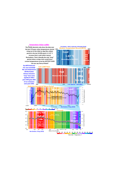
Stripe Charts – Temperature
CSS-38 I do get tired of seeing the many variations of the CAGW alarmist stripe chart. Virtually every version is cherry picked to start at the end of the Dalton Minimum (the last cold period of the Little Ice Age). I personally am thankful that we have warmed up 1.07 °C (according to the IPCC’s AR6 SPM report). The Dalton Minimum was not kind to humanity. So, yes, we have warmed up since the pre-industrial era, but that 1.07 °C is not unusual, not unprecedented, well within natural fluctuations and not all due to human CO2 emissions. Over 86% of human emissions occurred post-1950, yet roughly 50% of the 1.07 °C temperature rise occurred pre-1950 (i.e.: most of the pre-1950 warming would be due to natural forcings (solar and ocean cycles (primarily AMO)). Post-1950, CO2 may have a significant warming effect but there is still significant AMO and PDO warming visible even in the data as well. Some of the warming could be due to the aggressive homogenization typical in the surface temperature data sets.
#climatechange #delaythegreen #globalwarming #showusthedata
To put the Modern Temperature Record (MTR, 1850 to the present) warming in perspective, I have included a temperature stripe chart prepared by Dr. Roy Spencer from the University of Alabama, Huntsville (UAH). After all history did not begin in 1850. The much warmer Medieval Warm Period is easily visible in the Spencer chart (followed by the deep cold of the Little Ice Age). CO2 was virtually flat pre-MTR Holocene yet somehow temperatures were still fluctuating. The Spencer chart is likely based on the Greenland Ice Core data, but the general profiles using other global temperature datasets would be similar.
Humanity evolved from a hunter gatherer and small agricultural community framework over the Holocene to the modern society that we enjoy today. As an aside, that enjoyment has taken some serious self-induced hits over the last few years but that is a discussion for another day. That positive evolution was very dependent on the early warmth of the Holocene Climate Optimum and more recently, the Minoan, Roman, Medieval and Current Warm Periods. The colder periods (the Greek Dark Ages, the Dark Ages, the Little Ice Age, etc.) hindered human development through widespread crop failures, starvation, crippling epidemics, civil strife, etc. Most of the Holocene was much warmer than our current 15 °C (regardless of the temperature dataset used). The Holocene temperature stripe chart does not look nearly as imposing as the cherry-picked MTR version.
For a little more perspective, I also made a temperature stripe chart for the Cenozoic. We are living through the Pleistocene Ice Age (luckily in the warmth of the Holocene Interglacial Warm Period). That means we are still living through that deep cold blue period at the far right of the stripe chart (even with the Holocene warmth). Temperatures were over 11 °C warmer than now during the Eocene Climate Optimum (ECO) with CO2 concentrations in the 2,000-ppm range. Why is it called a Climate Optimum? Simple, life survived and thrived in the warmer temperatures and higher CO2 levels. Heat/CO2 are not an existential threat to humanity (even if we could get to the ECO levels). The 1 or 2 °C and few hundred ppm increases that we might achieve with our worst-case scenarios (not the IPCC implausible ones) will just be beneficial. Where the Climate becomes a problem is the short-term temperature drops over the next few decades due to cooling solar (GSM) and ocean cycles (AMO, PDO, etc.) and the unrelenting Milankovitch Cycle temperature declines that will push us into another deep ice age in the longer term.
The current CMIP6 computer model projections (which are self-admittedly running too hot and still using self-acknowledged implausible emission scenarios) still ignore most natural forcings and use unsubstantiated positive water vapor feedbacks. I wonder why their projections run too hot? The last slide visualizes the CO2 contribution to temperature change at various CO2 climate sensitivities (0.8 °C to 1.8 °C). Any CO2 climate sensitivities above 1.8 °C (the IPCC goes up to 5.6 °C) are ridiculous. Even 1.8 °C only gets a few of the CMIP6 projections close to the observed Lower Troposphere temperatures (CSS-30 – CMIP6 Climate Models). The CO2 climate sensitivities are not “settled science”. I prefer to use a sensitivity around 0.8 °C because that value corresponds to a proper incorporation of the Urban Heat Island Effect (UHIE) and recognizes that the sun (responsible for ≈99% of the energy that reaches this planet) is important to the analysis. The 0.8 °C sensitivity is also intrinsic to the University of Chicago’s MODTRAN model. That model accurately reproduces the satellite measurements of energy being radiated out to space.
Could the CO2 sensitivity be less than 0.8 °C? Yes, significantly so. A paper just released in April 2023 (Kauppinen & Malmi) suggests that the human contribution to the MTR warming is just 0.03 °C based on Henry’s Law. Not that hard to believe when you consider that the MTR can be closely modeled using just the solar activity (the Total Solar Irradiance (TSI) as a proxy) and the Atlantic Multidecadal Oscillation (AMO)). That scenario was laid out in my Open Letter Addendum and OPS-8 – Basic Climate Model posts. A later post (CSS-29) layers in a significant (but not dominant) CO2 forcing and models the Central England Temperatures (CET). My model is simple, but it models the MTR/CET better than the simplistic, unscientific CAGW (CO2 focused) narrative. Sadly, the CMIP6 models can model the MTR without CO2 contribution (as shown during beta testing). The solar forcings (Cosmic Ray Flux (CRF) and High Energy Particles (HEP)) added to the CMIP6 protocol, that make CO2 contribution unnecessary were obviously quickly turned off (or way down) to protect the narrative. Maybe turning on the solar forcings could fix that whole running too hot problem?
To sum it up, there is no climate emergency (at least not due to warming) and we are living through one of the coldest periods in the planet’s history (the minor/brief warmth of the Holocene Warm Period notwithstanding). A return to the temperatures of the Holocene Climate Optimum (HCO) would be immediately beneficial and would stay humanity’s dive into the depths of another Pleistocene deep ice age cycle by a few centuries, maybe a few millennia. That assumes we can even get to the HCO temperatures. The more likely scenario, temperatures have effectively peaked and the natural forcings (short and long) will just continue us down the deep ice age path and any CO2 influence will be impossible to see when our descendants (those that survive) look back. As for the Eocene Climate Optimum (ECO), we could easily survive those temperatures and higher CO2 levels, but we are physically incapable of reaching those levels based on our paltry influence. And finally, the Temperature Stripe charts put out by the CAGW alarmist community (1850 to the present) are pure, cherry-picked propaganda.

CSS-30 – CMIP6 Climate Models
OPS-55 – The State of Climate Science


CSS-24 – Is the Holocene Really an Epoch?


CSS-21 – CO2 – Visualized Temperature Contribution
CSS-30 – CMIP6 Climate Models

For more perspective and more detailed analysis, you can check out some of the following posts.
Climate Intelligence (CLINTEL)
No Tricks Zone – Stripe Chart Discussion
Kauppinen and Malmi (April 2023)
Open Letter Addendum
CSS-10 – A Ride Through the Cenozoic
CSS-21 – CO2 – Visualized Temperature Contribution
CSS-24 – Is the Holocene Really a New Epoch?
CSS-27 – Is CO2 Really the Primary Climate Driver?
CSS-29 – Climate Model – TSI-AMO-CO2
CSS-30 – CMIP6 Climate Models
OPS-55 – The State of the Climate
OPS-8 – Basic Climate Model


Pingback: Climate Change – Quick Hits