Climate Change – Quick Hits
OPS-68 One of the biggest problems climate realists face is the complexity of the Climate Change issue. You simply cannot present all the relevant data and economic/scientific analysis in formats that fit the concentration challenged Twitter world we live in today. You can focus in on specific parameters of the Climate Change Complex (Solar Cycles, Ocean Cycles, Satellite or Surface Temperatures, Ocean Heat Content, Climate Models, etc., etc.). But each of these parameters on their own are extremely complicated and have had hundreds, maybe thousands of papers and books written about them (often with many different interpretations). Or you can take the simplistic, unscientific CAGW alarmist position that the only significant climate driver is human emissions (primarily CO2). What is the problem with that approach? The answer is simple. There is no empirical CO2/Temperature dataset that shows CO2 driving the climate on any statistically significant historical time scale (a basic Scientific Method requirement).
#climatechange #delaythegreen #globalwarming #showusthedata
The other problem lies squarely with their “proof” (or more accurately their unsubstantiated, non-existent proof). All the stupid CO2 induced “green” policies (NetZero, Green New Plan, Inflation Reduction Act, ESG, etc., etc.) being unnecessarily forced on the taxpayers of the world are based on the UN/IPCC/WMO computer projections. Those very same models that the programmers self admit run too hot and use implausible emission scenarios (again self acknowledged by the IPCC). In what reality should policy makers be using computer projections that are obviously wrong and ignore most of the available data (with solar activity being the most obvious egregious omission)?
My approach relies on the empirical data (that very basic Scientific Method requirement mentioned earlier). I do not rely on images from the internet or the opinions from anywhere along the “Climate Change” spectrum. I download the data myself from NASA, NOAA and other scientific/academic institutions from around the world. I plot that data and give my interpretation/opinion of what that data shows. If the reader does not agree with the data or my opinion, they are welcome to put forward their own interpretation/opinion or an alternative dataset. My experience has shown that alternative interpretations (specific to the dataset presented) are rarely if ever brought forward and any datasets I have not used are not materially different than the datasets I used (i.e.: Berkeley Earth versus NASA/GISS surface temperatures or Vostok versus Dome C ice core data).
I have followed the “Global Warming/Climate Change/Climate Emergency/Next Scary Descriptor discussion closely since the early 1990s when I was the lead engineer on an Acid Gas Disposal Project (essentially a CO2 sequestration project (80% CO2/20% H2S)). CO2 credits/subsidies were being discussed at the time, but they were not available. So, assuming there is any significant merit to a carbon footprint, I am very comfortable with the one I will leave behind. In the thirty years plus I have followed (and researched) “Climate Change”, the omiss/dis/misinformation coming from the CAGW alarmist community has become abundantly clear. Their focus has been the last 170 years, where they can draw a “sloppy” correlation between global surface temperatures and rising CO2 concentrations. Their focus has more recently shifted to post-1950 data (just 70+ years). That shift is not unrealistic since 86% of our emissions have occurred post-1950, but they are still ignoring the natural forcings that existed prior to their focus periods, were acting during those periods and will be active in the future (just not in the virtual reality world created by their computer simulations). Ultimately, 70 years is meaningless in a climate discussion.
The images shown in this post are just a few of many data examples that are obviously not conforming to the CAGW alarmist narrative. The first plot (Point #2) shows the model output (pulled from the WMO website) compared to the HadCRUT5 surface temperature dataset and the UAH Lower Troposphere satellite temperature dataset. The datasets were normalized to December 1978 and clearly show that the models run too hot. Why do they run too hot? Again simple. They use a range of CO2 climate sensitivities (1.8 °C to 5.6 °C) and virtually and knowingly ignore natural forcings. Only a few projections (those using the lower end 1.8 °C value) approach reality. That value will drop when the natural forcings and other factors like Urban Heat Island Effects (UHIE) are recognized and factored in. For a little more to contemplate, check out the April 2023 paper (Kauppinen and Malmi) that uses Henry’s Law and limits human warming to 0.03 °C. My position would be 0.8 °C, as per the discussion in my last post (CSS-38 – Stripe Charts – Temperature). More detail available in my CSS-30 – CMIP6 Climate Models post.

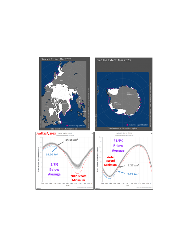
Point #3 lays out the measured temperatures in Antarctica (as measured by the UAH). Those temperatures have been statistically flat since satellite measurements became available. Measured data has been available since the 1950s. A simplistic average of the long-term weather stations shows that Antarctic temperatures have actually declined over the last 40 years culminating with the coldest 6-month period ever experienced/recorded in Antarctica in 2021 (averaging just -60.9 °C according to the NSIDC). A recent study (ERA5, Zhu et al 2021) also showed a 40-year decline in temperatures for Antarctica as a whole. To be fair, there are studies that show increases in temperature as well. Those links are available on my website. My CSS-27 – Is CO2 Really the Primary Climate Driver post was fact-checked based on that one single statement that Antarctic temperatures have dropped over the last 40 years. My rebuttal to that fact check is also included there. It is interesting to note that there were no other fact checks required on the post. Note that 90% of the ice on the planet is in an area that is extremely cold with only minor statistically insignificant warming.

Point #4 takes us to the other almost 10% of the ice on the planet, Greenland. Again, a very cold place. The average temperature in Greenland (unlike Antarctica) has been rising, but at a rather modest and non-menacing 1.01 °C/century rate (based on the NASA/GISS “homogenized” weather station datasets). The average Greenland temperature data is plotted against rising CO2 concentrations and the Atlantic Multi-decadal Oscillation (AMO). My interpretation would be that the AMO has more influence than the rising CO2 concentrations. But I would be happy to hear the argument to the contrary. The AMO is at the peak of its 30-year warming phase and has just entered a 30-year cooling phase that will very likely drop Greenland temperatures by ±1 °C (despite rising CO2 concentrations). That will also lower the 1.01 °C/decade trend value. Greenland (and Antarctica) are not melting anytime soon and sea levels were continue their long established, slow rise despite the CAGW alarmist cries to the contrary.

Point #5 looks at the Temperature/CO2 correlations over the Holocene Interglacial Warm Period. There is an important difference between this plot and the many other alarmist inspired plots of CO2 and global temperature. The CO2 scale is adjusted to reflect the CAGW alarmist viewpoint that the 1.07 °C temperature increase out of the pre-industrial era (based on the IPCC’s recent AR6 report) is due to the 135 ppm CO2 increase. Suddenly that “scary” CO2 increase depicted by Al Gore and others does not seem quite so dramatic. But there are still some problems with that alarmist interpretation. Over 86% of human emissions have occurred since 1950. But roughly half of the IPCC’s 1.07 °C temperature rise occurred pre-1950. A bit of a conundrum. Also, as shown in the temperature profiles (both Northern and Southern Hemispheres), temperatures started rising out of the Little Ice Age cold centuries before humanity could have had any significant influence on either CO2 or temperature.

But the major point to consider is the temperature fluctuations (on all Holocene temperature datasets) despite a virtually flat CO2 concentration. The natural forces were obviously active throughout the pre-industrial Holocene, they were still active during our current industrial growth period and will continue to be active in the future. Ignoring those natural forcings is a dangerous gamble. Cold is a far more dangerous option than the minor beneficial warming that CO2 might provide. The AMO will cool the planet (along with Greenland) over the next few decades and will be supplemented with additional cooling due to the forecasted Grand Solar Minimum (GSM) we are entering and just starting to experience. We should not be ignoring these cooling events. Sadly, we are.
Point #6 takes us into the economic realm. I can forgive the ordinary citizen for not understanding the very complex technical/scientific aspects of climate change. But the economic and environmental realities of the CAGW alarmist narratives are creating a world that will potentially be dystopian for my (and your) children and grandchildren. Canada’s Parliamentary Budget Office just put out a report (November 8th, 2022) that shows Canada’s GDP would be reduced by just 6.6%, 80 years from now (i.e.: our GDP will only grow 371.4% instead of 378.0% based on a 2%/year GDP growth rate). A second run with the Paris Accord commitments included, would only improve our GDP growth by 0.8% to 5.8%. That 0.8% GDP improvement is just 17 billion Canadian dollars. How much is that 0.8% improvement going to cost us? According to the McKinsey Net Zero Transition report, 7 trillion Canadian dollars. And what will the associated temperature improvement be? Not very much given that full global Paris Accord commitment compliance will only improve temperatures by roughly 0.17 °C in 2100 (using the IPCC “science”). Canada’s contribution (≈2%) would be (at an absolute maximum) just 0.0034 °C (as per my OPS-17 – Paris Accord 2015 post).

Only using Justin Trudeau’s business acumen could you rationalize spending $7 trillion to improve our GDP by just $17 billion. That is trillions to make billions. But then he did just approve a $13 billion in subsidies for the Volkswagen Battery Plant that will only cost $7 billion dollars to build. That one stupid decision eats up most of the $17 billion improvement that is available to us. Unfortunately, he is not alone (nor done). Calgary’s mayor has already pledged $87 billion to fight the Climate “Emergency”. We are wasting huge amounts of money to fight a problem that does not exist. All that wasted money must be borrowed and will be an enormous financial burden to our youth. All that wasted money could be directed to the real and immediate problems we are already facing (i.e.: the energy, food, supply chain, financial, etc. crises playing out right now). All that wasted money could be spent on adapting to the real climate threat (cold) that we will be experiencing over the next few decades than the perceived threat a century from now. Bottom line, there is no Climate Emergency (from warming)!
That is a very small representation of the problems associated with the CAGW alarmist narrative. Going “green” using renewables (wind and solar) and electric vehicles is not economically feasible, not scientifically justified and is not even environmentally or societally sound. How many whales, raptors, Congo children, Uyghur slaves must die before the alarmists consider it a problem? How many new environmental mining disasters will stem from the explosion of mining operations required to supply the forecasted renewable/EV needs? There are real existential threats facing us, but CO2 emissions is not one of them. I will (soon) put together a Climate Short Story (CSS) that looks at these Points in more detail and brings some additional points to the discussion.

CSS-26 – Greenland/Iceland – AMO/PDO/CO2
CSS-30 – CMIP6 Computer Models
CSS-32 – UAH Temperature Analysis
OPPS-22 – PBO – Climate Change and GDP
OPPS-23 – PBO – Trudeau’s Business Acumen
OPS-17 – Paris Accord 2015
OPS-55 – The State of Climate Science
Here are some additional articles/papers/posts that provide further context to this discussion.
Antarctica – ERA5 Temperature Study – Zhu et al 2021
https://www.mdpi.com/2073-4433/12/2/217/htm
Antarctica – Coldest 6 Month Period Ever Recorded
Henry’s Law – Kauppinen and Malmi (April 2023)
McKinsey Net Zero Transition
Parliamentary Budget Office – Global Greenhouse Gas Emissions and Canadian GDP
https://financialpost.com/opinion/parliamentary-budget-officer-debunk-climate-alarmism
Volkswagen Battery Plant Analysis
https://www.cbc.ca/news/business/volkswagen-battery-plant-analysis-1.6818025
Climate Short Story (CSS)
CSS-13 – A Look at Homogenization
CSS-23 – Greenland/Iceland Homogenization
CSS-26 – Greenland/Iceland – AMO/PDO/CO2 Distribution
CSS-27 – Is CO2 Really the Primary Climate Driver
CSS-30 – CMIP6 Climate Models
CSS-32 – UAH – Lower Troposphere Temperature – November 2022
CSS-38 – Stripe Charts – Temperature
One Page Summary (OPS)
OPS-17 – Paris Accord 2015
OPS-55 – The State of Climate Science
One Page Political Summary (OPPS)
OPPS-22 – PBO – GDP and Climate Change
OPPS-23 – PBO – Trudeau’s Business Acumen


Pingback: WMO – Global Warming Propaganda
Pingback: Satellite Temperature Comparisons