Extreme Weather Discussion

This is another area where the mainstream media loves to mislead its audience. Every hurricane, every wildfire, every drought, etc. is another example of climate change. No, they are just weather events. Hurricane Harvey and Irma were devastating storms, but they aren’t indicative of a climate trend. The 12 years without a Category 4+ hurricane that proceeded 2017 is more trend worthy than 2017. The global hurricane data is plotted in the upper left corner. There has been no statistical increase in the number of hurricanes over the 1961 to 2017 time period. Activity did pick up a bit after 1975 but has been steadily declining since the early 1980’s. There are two trend lines plotted. The flatter one includes all of the data, the steeper decline is based on the 1982 – 2017 time period. Note that 2017 was a very typical year based on the number of hurricanes. I’ve also plotted the CO2 data which has no correlation with the number of hurricanes.
The number of storms (tropical depressions including hurricanes) lays out a similar story. The data goes back a bit further to 1949. The number of storms actually peaked in 1971 and has been declining steadily since then. Again, there are two trend lines plotted. The flatter one includes all of the data, the steeper decline is based on the 1965 – 2017 time period. Note that 2017 was again a very typical year based on the number of storms.
I’ve also included a chart of the number of storms back to 1850. If the older historical data is correct, there was definitely a notable increase in storm activity in the Western Pacific and a more moderate increase in the Indian Ocean up until about 1960. Both areas have dropped off significantly from those peaks. The North Atlantic storm activity has been on a much more subdued but generally steady incline. Again, the CO2 does not correlate with the long term storm activity. Shortly after CO2 began its post-War accelerated increase, the number of storms began to drop. Obviously rising CO2 levels have not resulted in increasing tropical storm/hurricane activity.

As of August 9th, 2018, (source: Miami Patch, Paul Scicchitano) NOAA has downgraded their hurricane outlook for the remainder of the 2018 season. They are only expecting 9 – 13 named storms (wind speeds of 39 mph or greater). Of those four to seven storms are expected to become hurricanes with winds of 74 mph or greater. Major hurricanes (wind speeds of 111 mph or greater) may not even occur this year (with a maximum of two expected). 2017 was a typical year for the number of Atlantic storms, 2018 looks like a below average year. The data just does not support the argument of more extreme weather put forward in the mainstream media.
The same type of analysis can be and has been done for droughts, wildfires, tornado activity, etc. I’m not going to go through that exercise but I will point you to Roger Pielke Jr.’s presentation to the Subcommittee on Environment of the Committee on Science, Space, and Technology of the United States House of Representatives hearing (titled A Factual Look at the Relationship of Climate and Weather, December 11th, 2013).
http://sciencepolicy.colorado.edu/admin/publication_files/2013.38.pdf
The following discussion focusses on the current forest fire situation since that specific natural disaster scenario was not covered in Roger Pielke Jr.’s referenced submission.


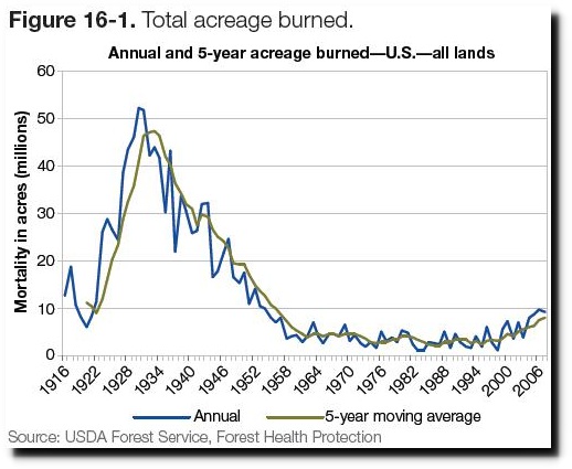
Given that summer is here once again in the northern hemisphere, a lot of people on the “Global Warming” side of the discussion need to be reminded that summer temperatures can get hot and the fire season coincides with summer. As usual the current media fixation on some record highs and devastating fires do not consider the historical trends. The planet has also been experiencing record lows and increased levels of precipitation. Individual weather events must be averaged across the globe and not taken in isolation. The early portion of the 20th century had a much more significant problem with forest fires. The burnt areal extent was 5 times higher during the 1930s. The table on the following page provides a general overview of what’s occurred since the USDA graph was finalized. The 2018 fire season (to date in the US) although higher is not significantly higher than the 2008-2018 average. Although the fire season is still in full swing, the overall burned acreage will not likely even get close to the levels experienced in the 1930s.
Even if 2018 turned out to be a record fire season (unlikely), that would still not be considered a trend and/or a direct correlation to “Global Warming”. You also have to separate out the severity of the fires from the fires themselves. Some fires may have become more damaging and newsworthy (i.e.: the recent Slave Lake and Fort McMurray fires in Canada and this year’s fires in California, Greece and Scandinavia) but the overall trends don’t back up a correlation with “Climate Change”.

The burnt area in the southern European Union Southern States has also been declining since 1980.


The satellite temperature data (UAH) is not showing any significant temperature increases that would make 2018 any more prone to record global temperatures or forest fires than any other year in the satellite period. In fact, the 2018 global temperatures are at the same levels experienced through most of the 21st century to date. Both 1998 and 2016 were noticeably warmer than 2018. July is the first month that has had a temperature anomaly greater than +0.3 °C in 2018. July 2018 (at +0.32 °C) is noticeably lower than the peaks in February 2016 (+0.85 °C) and October 2017 (+0.63 °C).
And we’ll just close out the forest fire discussion by addressing a perfect example of the misinformed hyperbole that various politicians and pundits employ which needlessly frightens the public and skews rational policy discussion. California Governor Jerry Brown recently declared (according to the True Pundit, August 3rd, 2018) that “since civilization emerged 10,000 years ago, we haven’t had this kind of heat condition, and it’s going to continue getting worse and that’s the way it is.”

As shown, on the previous page, global temperatures were generally higher in 1998, 2010, 2016 and 2017 (you don’t have to go back 10,000 years). So if you want to specifically talk about conditions in California in 2018, you have to frame the discussion as a weather discussion not a climate change discussion.
News reports (such as those coming out of California now), unfortunately focus only on the areas that are experiencing warmer than normal temperatures. The NOAA map above shows the global temperature anomalies for June 2018. A significant portion of the globe is also covered by areas that are colder than normal and an equally significant portion (Antarctica and the Arctic) are not even represented. That is the problem with the public discussion on “Climate Change”. Current events in weather mean virtually nothing in a true climate discussion unless they are tied into the longer term global trends.
But to get more area specific we can look at the longer term general temperature trends in the United States. The 1930’s were (by far) more affected by unusually high temperatures. The current heat wave index does not begin to compare with the severe heat those who lived through the 1930’s experienced. And most of them did not have the luxury of widespread air conditioning that fossil fuels have provided for us.


Another way of looking at the temperature data is to look at the number of days where temperatures reached extreme levels. The graph above lays out the percentage of summer days above 95 °F in the US. Again the 1930’s are substantially higher than the current conditions and the trend is down. The data trends for similar plots at 100 °F and 105 °F also trend downward.
I’ll also refer you back to the earlier fire discussion. Not surprisingly, the number of acres burned by fires was substantially higher in and around the 1930s. The drought conditions during that period were way beyond anything the US is currently experiencing. The plots below show the comparison between July 1934 and July 2018. To be fair to Governor Brown, California is going through an extremely difficult period but the situation is localized and is therefore a case of short term weather not climate (which is measured by changes in weather patterns over 30, 50, 100 year and millennial timescales).


You don’t have to go back 10,000 years to find temperature conditions that were warmer than this summer. But just to close out the loop, I’ve added a graph from earlier in the discussion that puts today’s temperatures into perspective. The temperatures for both Greenland and Antarctica have obviously been higher than current temperatures. The lower graph has combined the Greenland ice core temperatures (over the last 4,000 years) with the more recent HadCRUT Greenland temperature data.

