Holocene Stripe Chart – Fact Check
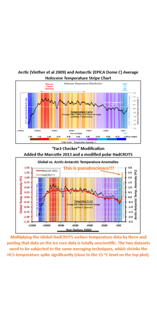
CSS-72 Back in April 2023, I posted my thoughts on Edward Hawkins Show Your Stripes “Movement” (CSS-38 – Stripe Charts – Temperature). Every year on June 21st we are inundated with red, white, and blue charts showing that the temperature has increased since 1850. So what? History began prior to 1850. My post looked at earlier historical temperature data (clearly showing that our current temperatures are not historically high. Recently, I had one of my charts “fact checked”. This is my rebuttal. The “fact checker” effectively uses Michael Mann’s ‘Nature trick’ (“a manipulation of climate data used by Michael Mann to create the iconic “hockey stick” graph”) by adding an arbitrary Arctic temperature spike to my graph which ignores the actual temperature estimates and the effects of averaging different data sets (in this case, ice core proxies and modern “homogenized” temperature records).
#climatechange #delaythegreen #globalwarming #showusthedata
My stripe chart averages the Vinther et al 2009 Arctic Average and the EPICA Dome C Antarctic ice core data sets. That average is consistent with the Marcotte 2013 provided by the “fact checker” and the Kaufmann 2020 data sets I detailed in my CSS-44 – Global Temperature Distributions post. The EPICA Dome C Antarctic ice core data set is localized but very similar to the average Antarctic temperature profile laid out in my CSS-45 – Antarctica Average Consolidated Temperature (AACT) post. All these ice core data sets are averaged over much longer periods than the modern temperature data spike tacked on to the Marcotte 2013 data set supplied by the “fact checker”. What happens when you apply consistent averaging to all the data sets? That spike gets reduced significantly.
This post includes a discussion that looks at the future scenario where the current warming (1850 to the present, likely a Dansgaard-Oeschger (DO) Event that began back in the late 1600s (i.e.: the Maunder Minimum)) transitions to the next Heinrich event (a sharp cooling event that takes us back into a new Little Ice Age (LIA)). This scenario has played out many times over the Holocene interglacial warm period we are currently living through (all without the influence of CO2’s all encompassing climate driving capabilities). There is no reason to expect that the ±1100-year (Bond/Eddy) cycle visible in the historical temperature data will not continue to play out in the future. To produce the Heinrich event, I just used the mirror image of the temperature rise since 1850. The combined Modern DO/H event represented in this post lays over the last DO/H event (the Medieval Warm Period) very closely. Averaging that dataset reduces the spike significantly (68.1% for the 100 YMA). Using the 200 YMA used for the ice core data, would reduce the spike by close to 80%. Right in the same range used for my stripe chart.
The Vinther data set is effectively a Greenland data set (5 cores from Greenland and one core from nearby Ellesmere Island in Canada). And what have temperatures been doing in Greenland? They have risen at a modest rate of ±1.0 °C/century (±1.75 °C/century since 1850). Note, those numbers are likely to decline over the next few decades as the Atlantic Multi-decadal Oscillation (AMO) moves into its cool phase (OPS-72 – Where are Greenland Temperatures Headed?) Well below the 3.0 °C spike provided by the “fact checker”. Applying a 200 YMA to the Greenland data would reduce the spike to the 0.35 °C range (below the current temperature shown on my stripe chart). Unfortunately, Antarctic measured temperatures do not go to 1850. Surface temperature measurements began in the 1940s and 1950s. Satellite measurements began in December 1978. What does that data show? Measured temperatures are lower than the 1950s and they have been statistically flat over the satellite record (1978 to 2025).
Temperatures were rising in Antarctica prior to 1950, but that rise had little to do with humanity’s emissions, given 87%+ of our emissions were post-1950. Out of the many ice core temperature datasets (provided in the earlier links), only the Kaufmann 2020 (using the CPS methodology) showed a significant temperature spike prior to 1950. The remaining methodologies showed only a minor increase. Using the same methodology used in my stripe chart produced similar results when applied to the Kaufmann CPS polar curves. And the polar averages reflect the global averages. There is no need to change my stripe chart. Effectively, the temperature increase shown in my chart is consistent with real world data. Current temperatures are shown to be approaching the Medieval Warm Period levels. We may have warmed significantly since the depths of the LIA (i.e.: the Maunder Minimum), but Greenland temperatures are still below the temperatures that the Vikings experienced during their Greenland colonization. Today’s Greenland climate would not have supported that colonization.
In my opinion, anytime you see the exaggerated temperature spike attached to a smoothed Holocene temperature profile (for example the “fact checker’s” Marcotte example), you are seeing pseudoscience at its finest. The data must have consistent averaging techniques. When the averaging is consistent the temperature rise since 1850 is on the same order of magnitude as the many, many other fluctuations over the Holocene. Slide CSS-72i compares a variety of data averaging periods for the Vinther and HadCRUT5 (HC5) temperature datasets.


CSS-44 – Global Temperature Distributions
CSS-45 – Antarctic Average Consolidated Temperature (AACT)

CSS-27 – Is CO2 Really the Primary Climate Driver


For more perspective and more detailed analysis, you can also check out some of the following posts.
Index of /pub/data/paleo/reconstructions/kaufman2020/
https://www.ncei.noaa.gov/pub/data/paleo/reconstructions/kaufman2020
NASA – Global Sea Surface Temperature Anomalies
https://www.earthdata.nasa.gov/news/worldview-image-archive/global-sea-surface-temperature-anomalies
Climate Short Story (CSS)
CSS-13 – A Look at Homogenization
CSS-27 – Is CO2 Really the Primary Climate Driver
CSS-38 – Stripe Charts – Temperature
CSS-44 – Global Temperature Distributions
CSS-45 – Antarctica Average Consolidated Temperature (AACT)
CSS-58 – More Solar Cycles
One Page Summary (OPS)
OPS-72 – Where Are Greenland Temperatures Headed?
https://climatechangeandmusic.com/where-are-greenlands-temperatures-headed/


Pingback: Climate Tipping Points