Global Temperature Distributions
CSS-44 The relentless bombardment continues. We are told that we are constantly experiencing the hottest day, month, year EVER, and unprecedented extreme weather, etc.! Those claims, in general, can be shown to be incorrect, misleading, or outright lies in almost all cases (once all the available data is reviewed). New records are always being set but they are not limited to the record high or above normal events we constantly see being reported. July was hot (and very hot) in many places around the world. The default reason always seems to be “Climate Change”. The truth is always more complicated. Is there any chance that those high temperatures were due to the El Niño we have entered, the Hunga-Tonga volcanic eruption (that NASA has told us has/will increase global temperatures), the warmer than normal Atlantic Sea Surface Temperatures or the recent increase in solar activity? Do CO2 concentration increases only act on temperatures in July? I do not remember June 2023 being labeled the hottest June EVER!
#climatechange #delaythegreen #globalwarming #showusthedata
The January 2023 temperature anomaly was negative (below average according to the satellite temperature data). CO2 levels have not changed enough from January to affect global temperatures. The recent changes including the July heat, are obviously naturally induced. Can CO2 increases be a small component of the temperature profile. Sure, but CO2 does not act alone and on short time scales is virtually a non-factor (regardless of who’s science is correct).
But this post is not meant to litigate the current temperature situation. The discussion focuses on global temperature distributions (not the localized or transient events emphasised in the media). The first two slides lay out the surface station density over time. Our surface temperature data records effectively began in the last half of the 19th century. As shown, there was very little coverage of world temperatures (outside of Europe and the Eastern USA) in 1880 (or before). That leaves a lot of room for error and/or biased estimates.
The situation had not improved much by 1930. Outside of the high-density additions in Japan and Eastern Australia, the rest of the world was still mostly sparsely covered. That could be important to the Dirty 30s discussion. Many claim that the serious drought/temperatures were not global and primarily limited to North America (debatable but we will not litigate that issue here either). The various global surface temperature estimates reflect that position. The hot temperatures of the 1930s (whether they were localized or not) have been homogenized out of existence. The current station status (2023) is obviously more widespread but there are still large gaps in many places around the world. Sea coverage was sparse until the ARGO buoys were deployed in the early 2000s.
The rest of the post looks at the average temperatures of the six 30° latitude bands that the planet can be divided into put together by Kaufmann et al. Their procedure and results are laid out in their 2020 paper “Holocene global mean surface temperature, a multi-method reconstruction approach”. Their data sets can be found on NOAA’s Paleo Data site. Those average temperatures are then compared to the Vinther et al Arctic Average and the Antarctica’s EPICA Dome C temperature data. The Kaufmann et al data uses 5 different statistical methods with 500 different proxy data sets.to come up with their average latitude band temperatures (and ultimately a global average). The end result shows that polar regions have larger magnitude changes than the lower latitudes. The northern hemisphere average is more reactive than the southern hemispheres. The individual southern hemisphere datasets appear to be more erratic than the respective individual northern hemisphere data sets (especially the 60S to 90S latitude). And an average of the Vinther et al Arctic and Antarctica EPICA Dome C ice core temperature estimates is a reasonable alternative to the Kaufmann et al average.
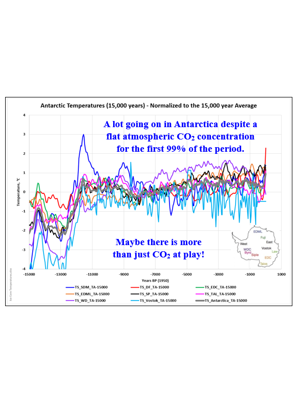
Kaufmann et al’s averaging process smooths out the data, hiding many of the important features visible in the many ice core data sets (and the Arctic average). An average of the Antarctic ice cores and the EPICA Dome C temperatures are shown in the attached plot. The two curves are very similar to one another over the Holocene. Using the Antarctic average will not change this evaluation significantly.

Note, the rapid temperature rise in the 60S to 90S latitude band I suspect will be used to promote the idea of catastrophic global warming and it is our fault. What they will not show is the 60N to 90N latitude band which shows no warming over the same time period. They will also not bother to mention that the temperature rise shown here occurred pre-1950. That temperature rise began around 1650 (long before humanity began affecting atmospheric CO2 concentrations. Over 86% of our emissions have occurred post-1950. Now we do have actual Antarctic surface temperature measurements since the 1950s and satellite measurements since December 1978. So, what are those temperatures doing? They have been essentially flat despite continually rising CO2 levels. The long-term surface data trends are included in my CSS-13 – A Look at Homogenization post, the Satellite data is shown in my CSS-32 – UAH-LT Temperature – November 2022 and CSS-40 – Satellite Temperature Comparison posts.


Kaufmann et al 2022 – Data Files
Kaufmann et al 2020 – Holocene global mean surface temperature, a multi-method reconstruction approach


CSS-10 – A Ride Through the Cenozoic

For more perspective and more detailed analysis, you can check out some of the following posts.
NOAA’s National Center for Environmental Information (NCEI)
Index of /pub/data/paleo/reconstructions/kaufman2020 (noaa.gov)
https://www.ncei.noaa.gov/access/paleo-search/?dataTypeId=7
Kaufmann et al 2020 – Holocene global mean surface temperature, a multi-method reconstruction approach
Climate Short Story (CSS)
CSS-13 – A Look at Homogenization
CSS-32 – UAH-LT Temperature – November 2022
CSS-40 – Satellite Temperature Comparisons


